

How I made the Boston Marathon poster
More than thirty thousand runners took the same road in April, from a small town in the woods to a street in the middle of a city. I wanted to see what it looks like as a map.
One road, eight towns
It is the world’s oldest annual marathon, and the only one you have to earn your way into. Boston does not loop. It starts in Hopkinton, at about 490 feet above the sea, and it ends on Boylston Street, at about 10. Between the two, eight cities and towns, strung on one road heading east: Hopkinton, Ashland, Framingham, Natick, Wellesley, Newton, Brookline, Boston. The course drops 459 feet from start to finish, one of the reasons Boston times cannot count as world records. On paper, it sounds fast. Ask anyone who has run it, and they will tell you it isn’t.
Halfway, Wellesley College, where the students line the road and you hear them before you see them. Then Newton, and the hills, the last of them between mile 20 and 21. It has a name, Heartbreak Hill, and it is not very high. That is the point. It comes after twenty miles.
Then Brookline, Kenmore, and the two turns every runner knows by heart: right on Hereford, left on Boylston. The finish is straight ahead.
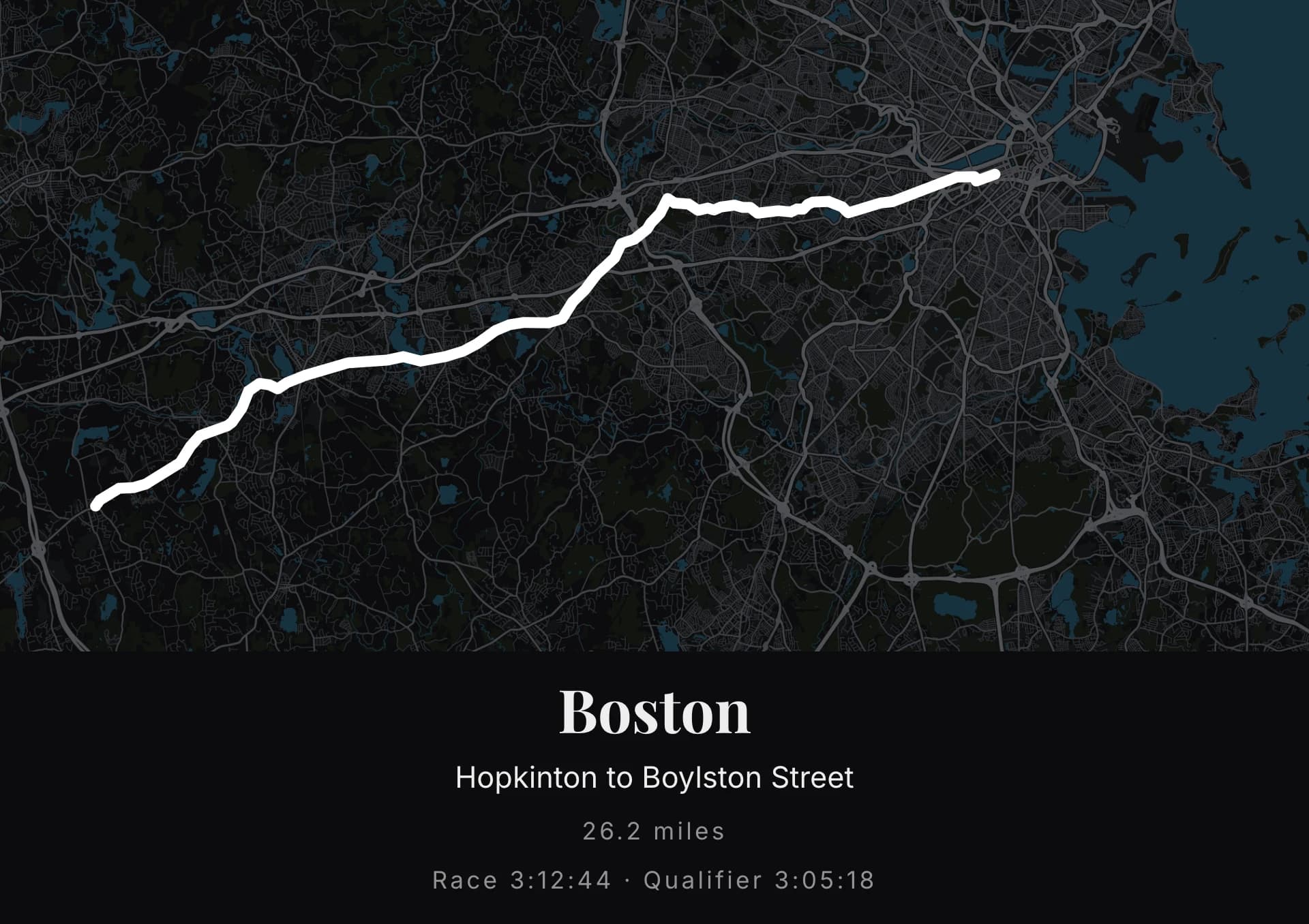
On a map, that is what you see first. A line that runs west to east and never comes back. Eight towns on it, like beads. And at the very end, in the grid of the Back Bay, a hook you have to know is there: two turns, the only ones in the last miles. On a poster it is a millimetre. It is also the whole race.
The trace
The road is the same for everyone. I traced it from the official course: I have not run Boston.
If you have, yours is in your watch, and it is not quite this one. It has your tangents, the ones you did not cut. It has the wobble at Wellesley, where you drifted to the left of the road for the noise. And it has the hook, exactly like everyone else’s, because there is no other way to get to Boylston Street.
In the configurator
In the configurator, I import the trace. The map jumps to the start, in Hopkinton, at a height where the whole road fits. I pulled the frame east until the harbour came in, and that one move settled the whole poster. Out west it is all suburbs, a scatter of streets with no shape to them; the line had nothing to end against. Bring in the coast and the water, and the race arrives somewhere. The file can come from a Garmin watch, a phone, or Strava.
A watch file has no waypoints. The line alone, then, and the caption will name the start and the finish. If your watch kept the name of the run, it is already there. I called mine “Boston”.
The line: thick. This is a city and its suburbs, and the streets are dense; a thin line would disappear into them. The trace has to sit above the map.
The palette: none of the ones in the configurator. I started with Blanc & noir, which is exactly what the race deserves on paper, a black ground and the road in white. It does not work: that palette draws the motorways in the same white and just as thick, so the Mass Pike and the marathon are one line and you cannot tell them apart. Thickness could not save it, and neither could a warmer colour, which only made the trace legible on a map that was still shouting.
So I wrote the colours one by one, and called it La côte. Everything goes down: the ground to near-black, the motorways to a middle grey, the small streets to almost nothing. Two things stay lit. The water, in a deep teal, which gives the poster the harbour, the islands and the ponds along the road. And the line, which is now the only pure white on the sheet.
The caption
The title holds its line. The subtitle: Hopkinton to Boylston Street.
Then the distance, and here you have to choose. The configurator measures it on the trace, in miles, and a watch almost always gives more than 26.2: the tangents, the crowds, the wobble at Wellesley. I typed 26.2 by hand; the field switches to manual and stays put. That is the distance of the race, not of the watch, and on a wall it is the race you want to read.
Then the line that belongs to you alone: the time. And the one that belongs to Boston: the qualifying time you ran somewhere else, months before, to be allowed to stand in Hopkinton. Two times on one poster. Nobody who has not run it will understand why there are two. Everybody who has will.
The two share one line, because the caption has one free line and I would not give it to anything else. Not to the date: Boston is always the third Monday of April, and everyone who cares already knows. And not to the coordinates, which are off. On a point-to-point course they would say Hopkinton, and Hopkinton is not the point.
The size
A road running west to east wants a landscape poster. I chose an A2, 16.5 by 23.4 inches: wide enough for eight towns to read, small enough for a hallway, where you pass it every day.
On the wall
A line that does not come back, eight towns, a hook, two times. Someone walking past sees a map of Boston and its suburbs. You see mile 21.
The best moment is the day after: the trace is still in the watch, and the legs still remember. A few minutes are enough.
You may not have run it. But you may know someone who did. The qualifying time is in their history. The race time is in their watch. The trace is already there.
It only needs a place on the wall.